Judge a Book by Its Cover, I Dare You
 So, covers. We’ve been told not to judge books by them since 1860 when George Elliot wrote the phrase (according to Wikipedia). But, let’s be honest – we all do. There are things I own entirely because of the covers. Granted, most of those are new editions of books I already love. Lots and lots of things from Penguin spring to mind. Here, for example, is the Penguin Classics Deluxe Charlie & the Chocolate Factory. Yep. Got it. I have the Three Musketeers too. And Jane Eyre.
  And Pride & Prejudice. I have some of their cloth bound hardcovers too. And some of the Penguin Threads editions. I love you Penguin! (Look, I’m a fangirl. I admit it. I love their design teams so hard.)
The Magicians by Lev Grossman is another book with an amazing cover. That’s actually a model. How cool is that?
Random House did a pretty cool job with Angelmaker. Harper did well with Partials. But sometimes, there’s a swing and a miss.


Stephen King did a really interesting article for Entertainment Weekly back in 2007 about a novel called Fieldwork. His basic argument is that it’s a really interesting book that no one will ever pick up because it has the most generic, uninteresting cover ever. That apparently hit home with the design department at Farrar, Straus and Giroux because while the misty grey/green book on the left is the hardcover dust jacket, the bright and exciting book on the right is what they put together for the paperback release. Which one of those would you be more likely to pick up?
I’ve been thinking about covers lately since we’re putting together our holiday displays at Little Professor. We’ve got an entire display of awesome Penguin covers (fan-girl, remember?).
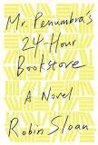 Maybe it’s wrong of me, but I do judge books by their covers. When I’m browsing I’ll pick something up if the cover art is good, or interesting, or even horrible. But the problem is with books where the cover art just doesn’t catch my attention. Sometimes the title can make up for it. Mr. Penumbra’s 24-Hour Bookstore is one with an attention grabbing title, but not particularly compelling cover art for me. It’s fine. It’s yellow. But it makes me think of Post-It Notes not fascinating novels.
I also read widely in the fantasy genre. Covers can vary widely there. The Magicians has a pretty awesome cover. Stephanie Burgis’s Kat books have awesome US covers. The UK covers are very different, but still charming. Then there are others. Cracked.com did an entire article on best and worst fantasy covers. I’ll let you go read that rather than doing my own run down.
Sometimes, a book will really surprise me. I didn’t expect much from The Iron Duke when I first picked it up. But it was steampunk and romance and one of my book clubs was reading it. It’s awesome. But, the cover is still a little off for me. There are some comic books I can barely read because their covers are so… implausible. Richard K. Morgan’s run on Black Widow springs to mind at the moment just because I’ve been looking at his website today. I’m not sure what’s going on in the picture I linked, but I’m positive she’s going to need a chiropractor after it’s over. There are lots of people taking on the position of women in comics and women’s position on comics. The Hawkeye Initiative is pretty hilarious.
I’m a visual person. I think lots of readers are. So, book covers, while not vital to me, are important. I need them to be attractive, or at least cool. Nick Harkaway’s first book, The Gone Away World, was hot pink and fuzzy, like a peach. It wasn’t pretty, but it was distinctive. What do you think about covers? Leave me a comment about it. I’ll chose a random comment and send you one of the amazing books from Penguin!
 #77. Riveted by Meljean Brook
I’ve read the other books in this series already (#19 and #24). I love this series, but at the same time, I don’t love the covers. It’s not that they’re bad. They’re a little… silly? I’m not sure if that’s the word I mean, but I think it is. I think I’d probably like them more if they were painted or sketched rather than being photographed. The limitations of photography and costuming lead to some slightly unfortunate things. This one is probably my favorite of the three covers, but I don’t feel it accurately represents the characters. Oh, wait, a fantasy/sci-fi cover where the people don’t look right? That never happens!
Annika and David Kentewess are our protagonists. Annika is from a hidden community in Iceland. Their primary goal is to remain hidden, to stay safe. Secrecy is so important that Annika doesn’t dare tell anyone what country she’s from, much less anything about her actual life. David is kind, but he is also threat to Annika’s entire village. He is coming to Iceland as part of a geologic survey. Ostensibly, he is working on a planned railroad that will connect the coastal villages. Annika is drawn to him, but cannot risk exposing her family to outsiders. Things are further complicated by the fact that David’s mother originally came from Annika’s village. David has sworn an oath to return her necklace to her home and he knows Annika holds the clues to completing his quest.
The story has all the drama and danger of the previous books. But the coolest part is the world building. I’m convinced the Ms. Brook knows what’s happening on every continent of her world. She’s fleshed out the mythology and history of Iceland. David is half Native American and though his father’s history doesn’t come into play much, it’s still a part of the story. They meet in Navarra, a Castilian port city where the poor are legion and charity is a crime. I never want this series to end because I want to know about all the different places. I’d love a story set among the native settlers of the New World. I want to know what’s going on inside the Horde controlled territories. How is Australia faring? What about South East Asia? I want it all? I want the loss of Venice. I want Leonardo da Vinci’s clockwork army fighting the Horde and the zombies. I’m very demanding, but I want to know! And the thing is, I’m pretty sure Meljean Brook already does. I just need her to tell me.
As a side note, this book made it onto my Top Ten list for the year. I’m not saying you have to read it. I’m just saying that I’ll judge you if you don’t.
#78. On Basilisk Station by David Webber
I blame the Sword & Laser podcast for this one. I don’t actually read very much hard sci-fi. Most of my experience with that kind of thing is Heinlein and Richard K. Morgan. I almost never read space opera. But this one has a kitty! Look, I’m not saying I read this book entirely because there’s a telepathic tree cat. I’m just saying that historically speaking, I’m more willing to read hard sci-fi if it has some sort of furry companion, preferably of the feline variety (Werehunter, Sholan Alliance, The Cat Who Walks Through Walls, The Door Into Summer, Patient Zero). David Weber has created Commander Honor Harrington, an officer in the Royal Manticorian Navy. Honor is given command of the light cruiser Fearless which has been refitted with a ridiculous weapons array at the whim of Admiral Hemphill. When tactical exercises prove that the load out on the Fearless is tragically flawed, Honor and her ship are banished to Basilisk Station by the embarrassed Admiral. Basilisk Station has long been the dumping ground for the unsatisfactory elements of the Navy; people that can’t quite be drummed out of the service, but just aren’t good at anything. When Honor shows up planning to actually do her job not everyone is happy. Furthermore, Basilisk is a bout the be the sight of a dramatic fight and Honor has only one light cruiser to stop a full scale invasion.
I listened to this on audio and it was long, but awesome. The audio is almost 16 hours so it took me quite a while to listen to it. The narrator is excellent, however, and I highly recommend it to anyone that enjoys audiobooks. Another cool thing- Baen Books is going to be doing a 20th Anniversary leather bound edition of On Basilisk Station that will come out in April of 2013.


Trackbacks